Card sort testing results

content Design

Content Testing

Objective

Create content that resonates with users, speaks directly to their pain points, and provides enough context to help them successfully complete tasks.

Problem

Best practices and experience have limits. Whenever possible, we should test content with real users.

Approach

Create, share, and review tests with my team in Miro and Figma, run tests in User Zoom.

Card Sort Testing

Background:

I wanted to ensure content for a new feature (Well-Being Club) was findable, usable, and understandable.

Test:

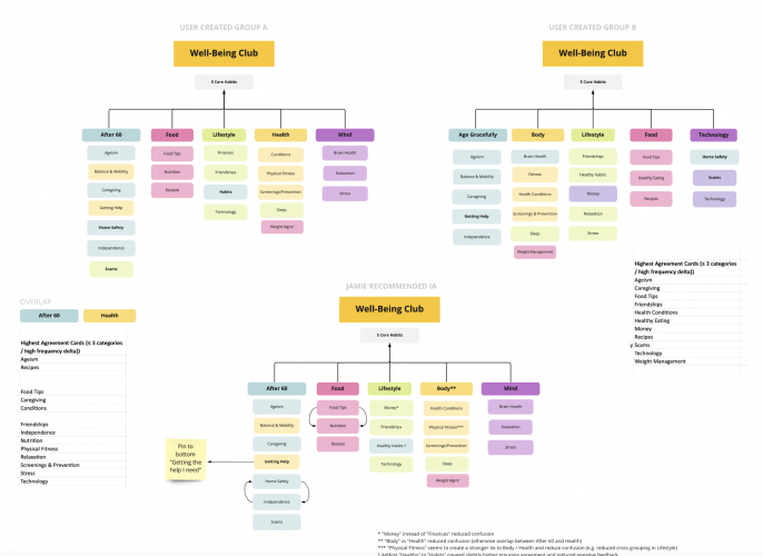
I started with a card sort test for two audience groups (A and B) to help determine initial category and label alignment. After analyzing the results, I created two new versions and ran a second closed sort test, which revealed key structural insights and strong label preferences. Based on the results from this test, I put together a revised model and presented my recommendations to our clinical health team.    

Results:

Testing helped me gain better understanding of audience mental models and provided the data I needed to push back against confusing terminology and categorization suggestions our clinical team originally provided. Armed with test results and well-informed recommendations, I was able to make a successful case for restructuring and relabeling our content in a way that made the most sense to our members.  
Homepage Module Testing

Background:

My company released a new fitness program open to everyone, no employer or health plan sponsor required. We added a module on the homepage to nudge eligible users to a separate, subsidized fitness program so we could reduce bounces due to pricing sensitivity. I wanted to determine the most effective headline and body content combination.

Test:

I ran two tests, one to determine the effectiveness of loss aversion with an emphasis on user benefits and the other to evaluate different headline concepts.  

Results:

My loss aversion variant beat control and the preferred headline built intrigue with a leading question. 

Takeaways:

  • Removing vague or difficult to understand language like “affiliations” and “associations” improved user understanding, specifically when it came to eligibility. Control users were often unsure if they were signing up for a gym discount or a program to provide access to a gym discount. When asked to summarize their understanding, many Control group responses focused on the discount and did not write about the eligibility aspect, which seemed to indicate a potential lack of program understanding. Variant group responses mentioned checking eligibility with their employer or insurance, which indicated a better overall understanding of the program requirements.
  • User sentiment shifted when clarity improved. Some members did not think they would qualify for the “discount” when they read the Control version. This group was significantly less likely to perform the intended action.
  • The winning headlines used behavioral economics concepts (create intrigue, loss aversion). The body copy reinforced the concept, and the CTA aligned with both. This led to positive qualitative feedback:
    “I prefer version B because to me it points out that you are missing an opportunity to pay less and everyone wants to save money and not miss an opportunity, it just catches my attention more.”
    “I like B because it makes me feel like it something that is rare and I am seeing if i can be a part of it.”
    “‘Are You Eligible’ is my preference because it tells me why I’m clicking ‘find out more’ and makes me want to actually find out if I’m eligible.”
    “Makes it sound like there is a real benefit to clicking on the ad.

Payment Error Testing

Background:

Users received an error message with an incorrect date after their payment was declined. Backend developers didn’t have enough capacity to fix the broken logic, so I rewrote the content as a quick fix. I viewed this as an opportunity to test concepts instead of simply removing the date.

Test:

I tested four different error messages using the following behavioral economics concepts:

  • “Help us help you”: People may be more inclined to act when they feel we’re helping, not penalizing.
  • Small ask: When we ask people to do something, it’s instinct to view it as a potential threat. The smaller the initial ask, the smaller the fight/flight/freeze response and the more likely they are to agree to larger requests later on.
  • Loss aversion: People hate letting go of what they have, and the feeling of losing something is often more intense than the feeling of gaining something new.
  • Zeigarnik effect: A task in progress creates task-specific tension. The tension is often relieved when the task is done. If the task is interrupted, the tension remains.
  •  

Results:

Testing indicated a slightly higher preference for the loss aversion content.

Takeaways:

I plan to conduct further testing to validate this result given testers could view each message and choose their favorite. A single-blind study that includes performing an action instead of choosing preferred copy is a good next step.

© 2023 Jamie Giannini