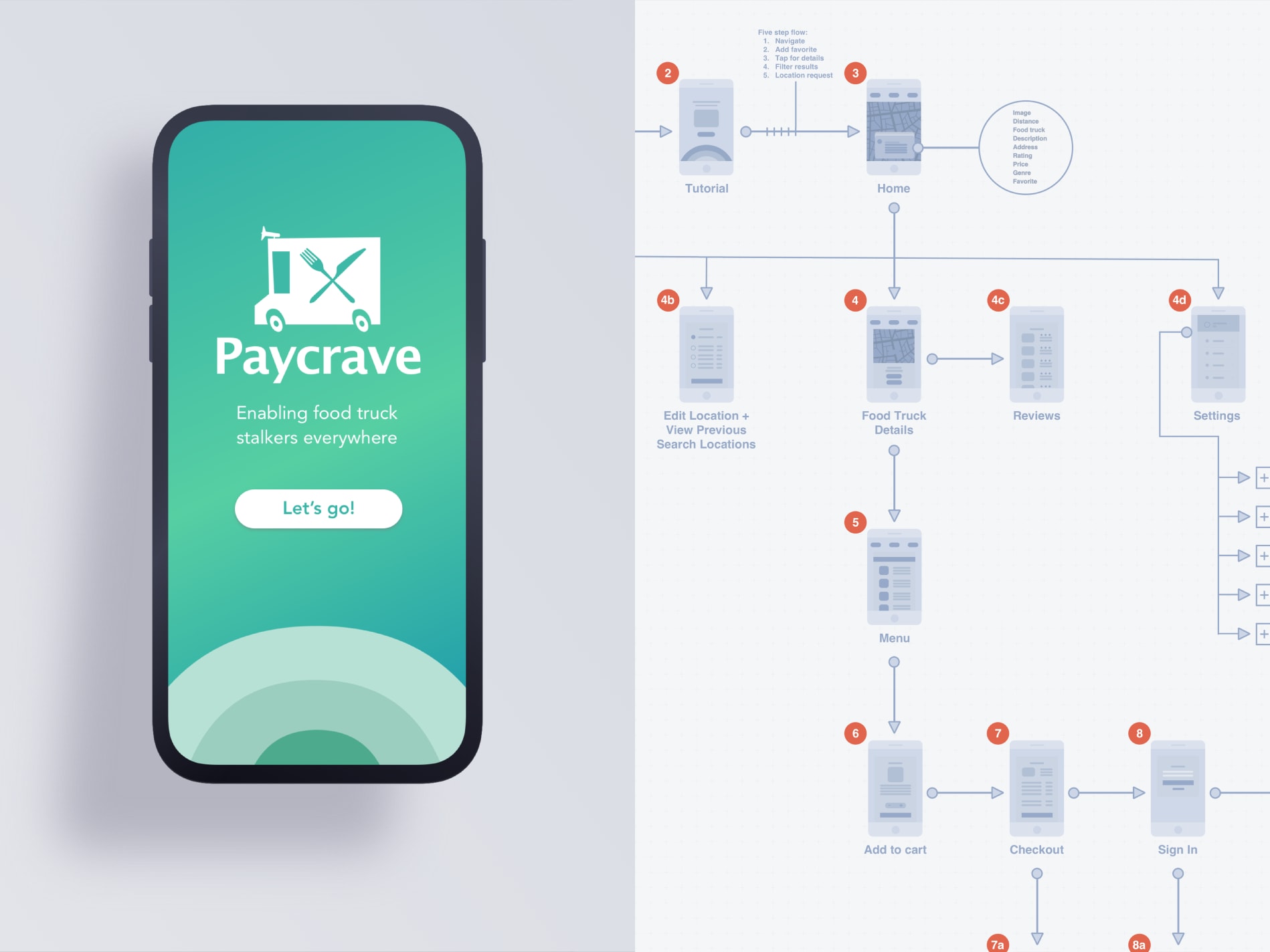
Completing this personal project led to a deep examination of the process involved in creating an entire mobile application from idea to functioning prototype. I started with determining the problems to solve, developed user personas, thought through the app’s information architecture, iterated through multiple wireframes, and ended with a high-fidelity mockup and animated prototype. I’m proud of the outcome and enjoyed every second of this project; I hope it shows. Please read on to see more of my process and view the final product.
I approach every project with a user-centered mindset and a deep interest in understanding my target population. It helps to observe and develop empathy with users before starting the first wireframe or user flow. This type of thinking also helps me with the process of questioning: questioning the problems, questioning the assumptions, and questioning the implications. Ideally trying to answer questions like:
What is our objective with this product?
Who are our users?
When is it used?
What specific situations is it used in?
What’s the most important functionality?
What problems are users currently experiencing?
How are they solving these problems?
Creating personas helps put a face to this information and provide important design guidance. Here are a few sample personas I created for potential Paycrave users:
After learning about our target users and empathizing with their needs and problems, it’s helpful to begin thinking about how our solutions can be:
Paycrave connects users with local food trucks and easily order food for pickup. It’s useful for both users and food truck owners.
Start screen – app splash and first time experience (FTE). Note: subsequent sessions bypass the FTE.
After completing order, viewing the order status, and picking up the food, the last step is to close the feedback loop by rating the delivery experience.
Users may swipe through the map, add filters to narrow their search, change their location, tap on a food truck to view details and start an order, or navigate to settings.
Before entering app, users should understand how to: navigate, add a favorite food truck, view food truck details, filter results, and confirm location.
Primarily through utilizing the map to view real-time truck locations near them, or through setting the search filters to view popular trucks, highest rated trucks, favorite trucks, and more. Filters are expandable as app’s scope increases.
Each food truck card should contain: image of truck and additional optional gallery of images, distance from user, business description, address, rating, price, genre, favorite (or not).
Users should be able to edit account information (avatar, contact information, location, payments), view all past orders, view favorite food trucks, access alerts or updates, and sign out of their account.
Initial search filters should include: cuisine styles, distance, price, operating hours, rating, popular, favorites.
After locating a truck of their choice, the user may tap on the truck to view details. The menu must be the top priority CTA within the details view given this is the primary action users want to take when viewing a truck.
After selecting the menu, the user may view items, make selections, add to cart, checkout (edit cart, edit payment details, then sign in or create an account to complete the order. After successful order submission, an order status screen provides the user with real-time order updates.
The order status screen lets the user know when their order is ready for pickup. After pickup, the user is prompted to provide a rating of the experience. This feedback loop is an important piece of the app’s rating and ranking algorithm to help users find the best trucks near them.
I wanted to make the checkout process quick and straightforward. By adding the ability to create an account, we can ideally bypass this entire process the next time a user logs in and decides to place an order. I felt it was important to hold off on asking a user to create an account until they’re already invested by adding items to their cart and continuing on to checkout.
After placing an order, users should be able to easily view progress so they understand when their order is ready for pickup. From this screen, users also have access to the map in case they need help locating the truck. We’d pair this with a notification when their order is ready, since it’s not realistic to expect them to keep the app open for the duration of the order prep.
Lastly, users need to have the ability to provide feedback and leave a review. Not only does it help add to the app’s credibility, but it also generates valuable data we can surface and utilize to enhance the member experience. Most restaurant ecosystems rely on this system to also boost their SEM rankings.
© 2022 Jamie Giannini